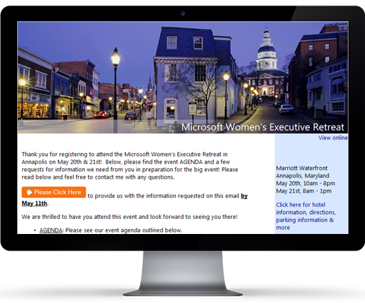
11 Tips to Improve Your Landing Page
Define Your Conversion
Before you start to design your landing page, define that page’s conversion activity. For a newsletter landing page, the conversion activity is entering an email address into a form and clicking “Accept.”
Do a Little Research
A little demographic research goes a long way. Figure out what your visitor is looking for and what offers work. Build a profile of your ideal visitor. Keep this person in mind when creating your landing page. Do not construct the page for anyone else—generic and broad pages are proven to fail—and keep everything “on target.” Your ad campaign already funnels traffic to your landing page, so visitors are expecting a very targeted message. Tailor the pages to them.
Eliminate unneeded Elements
Distractions kill conversions. Strip any unneeded elements from the page. This is not your home page. Anyone who comes to your landing page has already been screened by your ad. They expect a very specific message.
Match the Creative
The landing page and creative should match. The easiest way to clue visitors in that they have arrived at the right place is to use the heading from your ad creative.
Remove Navigation
If you can, remove the navigation bar. Of course, don’t remove it if it is essential to the conversion process. Remember your message, and if a link has nothing to with it—chuck it!
Stay Focused
Avoid the urge to promote or link to other areas of your site. The point of the landing page is to prevent your visitor from wandering. You want them converting, not clicking around to other parts of your site and marveling at your Flash animations. Imagine if GAP encouraged shoppers entering their stores to leave and walk around the mall. Once they stop thinking about your offer, you’ve lost them.
Important Elements Above the “Fold”
Pay attention to the virtual fold (the bottom of the screen before scrolling). Place enough content above the fold to allow your visitor to make a decision about continuing on the site. If a visitor has to click or scroll to figure out what your site is about, the only thing they’ll click is the back button.
Provide Conversion Exits
Make it easy for your visitor to convert. Place conversion exits above the fold and at every scroll-and-a-half of screen space.
Lead the Eye
Use typography and color to your advantage. Lead the eye along the page towards the conversion exit. Thoughtful use of whitespace, large copy and graphics can make a long page seem much shorter than it really is. Be careful though—a great image will demand a lot of eye time and if misplaced can ruin the flow of your message.
Place the important stuff (whether it’s your copy or your image) close to the middle, and never distract your user from that focal point. Avoid putting interesting material in sidebars. This pulls the eye away from the main body. If it’s interesting and valuable, keep it close to the center and use it to direct the eye.
Fix Forms
Optimize your forms. Make the input cursor hop to the next field after a user finishes the current field. Allow the user to tab around fields. Auto-populate any fields you can.
Remove all unneeded fields. Don’t ask for city/state/province if you ask for a Zip or postal code. Focus on the essentials.
If you’re asking users to register for a newsletter, ask for only an email address. You don’t need their name now. Get rid of the reset button. It’s dangerous for both the user and you.
Test, Test, Test
After you have finished the design of your landing page, test it with a small user group. Go over a checklist with your design team:
-
- Is the whole page focused?
- Does the message match the advertisement?
- Have you reduced all distractions?
- Is critical information above the fold?
- Are there enough conversion exits?
- Does the page enhance your brand?


Recent Comments